Strategy
John Lewis & Partners had completed a fiscal study, which informed them that their customers would value the ability to purchase products online using either Interest Free Credit (0% finance), or Interest Bearing Credit (e.g. 14% APR finance). This would complement their existing in-store credit service.
Research
Content
In order to understand the impact of providing credit online, it was important to understand all existing touchpoints for the incumbent credit service and uncover as many new touchpoints as possible. This was used to inform and guide any research required.
Results
Touchpoints
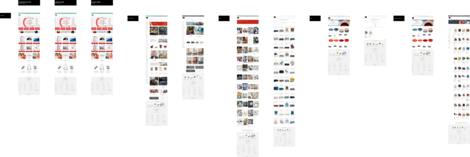
- Homepage to introduce & promote the availability of the service
- Category pages & Product List Pages to inform the customer which products could be purchased on credit
- Product Detail Pages to inform the customer that credit was available, and give indicative costs
- Service Pages to help customers understand the service, and get help when needed
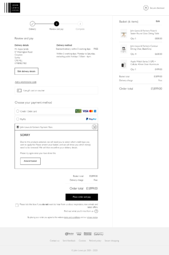
- Checkout to facilitate the purchase of (compatible) products using credit
- CRM/Marketing Emails to inform the customer of the service
- CRM/Service Emails to support purchases using the credit service
- Contact Centre to support customers and help when needed
- In-store staff to promote the service, and assist customers where required
- 3rd Party credit provider to provide & support the service, upholding John Lewis & Partners values & quality of service
- In-store POS informing in-store customers that credit was available, and which products could be purchased on credit
- Marketing to support and market the credit service where require

Research
It became apparent that research would be required to understand…
- the existing credit service in detail – any successes or problems it had,
- how the existing credit service was promoted
- how the existing credit service was served to customers in-store
- how customers currently view credit
- when/why they would use credit
Competitors
Whilst there were no direct competitors in the market – covering a similar range of products – several existing retailers were offering credit to their customers. In order to understand, and compare, these retailers, a heuristic analysis would be required for a number of competitors.
Empathise & Understand
Customer perspective
Customers were likely to purchase using credit when
- The item(s) were a considered large-value purchase – e.g. TV
- The purchase cost exceeded their personal maximum credit-card monthly payment
- The credit offered incurred minimal (or no) additional cost to purchase – or that payments were flexible to prevent this
- The full-terms and conditions of the credit were available
- For most purchases, the item(s) would be first viewed in-store
Existing internal personas were investigated, and successfully mapped, to form several actors for the design processes.
Business perspective
Confidential
Create
Flows
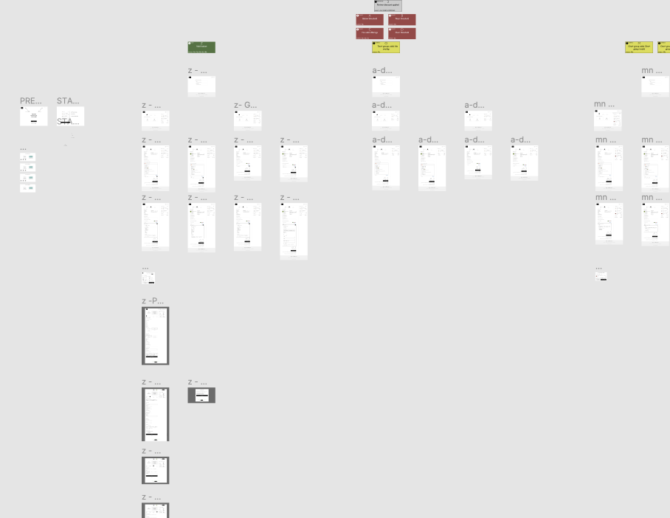
A number of service flows were created, to map out the customer & business journeys required in providing online credit. In order to minimise business impact, existing flows that had little or no issues were left untouched, saving a few months of effort for the project. However, considerable new flows were required – including migrating the in-store credit service.

Wireframes
Starting with the simplest flow – a valid basket, purchased using Interest Free Credit – allowed us to internally validate potential technical constraints, solving these before initial user testing. Several rounds of user testing were conducted, iterating and improving the flow and user interface.
Additional flows were then created for other journeys – such as when customers were rejected for credit, or system errors occurred. In all, over 100 screen variants were produced, quickly created through utilising atomic design principle in Figma.

Prototypes
Numerous prototypes were created using Figma – this allowed numerous customer journeys – including edge cases – to be tested. These were shared with the project team, including all stakeholders – who often used them in presentations to senior management & the board.
UI Design
High fidelity wireframes were exported from Figma to Sketch, the in-house design tool. In order to simplify screen variants, a bespoke naming convention was created, so the entire team could easily reference screens precisely.

Copy Design
All copy in the service were carefully crafted by UX Copywriters. All copy was entered directly into a Google Sheet – also utilising the naming convention – so that all copy, including labels, CTAs etc. could be entered, approved (especially compliance), and then directly referenced for development.
Test
Numerous rounds of user testing were conducted, honing the content, flow and proposition. All in-store UX Design was conducted by a colleague, allowing me to concentrate on the entire online proposition. Working highly collaboratively, allowed us to align all experiences.
Further user testing was conducted, on an ad-hoc basis, but, due to the quality of the testing at the start of the project, very little was required.
Develop
I worked closely with the development team, including the Product Owner, Business Analyst, System Architects, and Front- and Back-end Developers. Due to the collaborative process used through the project, very little amends were required – just numerous very edge-cases were identified by the team, and UX designed to alleviate any customer concerns IF they occured.
The project successfully launched in February 2021, approximately one year after its inception. Unfortunately, I have no statistics on the success of the project, due to my contract finishing.