Brief
As sponsors of the Wilderness Festival, held annually in Oxfordshire, Victorinox requested an app that would support visitors. This would be required to support their brand values, and also promote their Victorinox Editions range of outdoor clothing and accessories – designed exclusively for them by Christopher Raeburn.
Brand values
- Quality
- Functionality
- Innovation
- Iconic Design
Process
Strategy
- Design a free app that met all the brand values.
- Optimise functionality to support the Wilderness Festival, and any other festival.
- Allow for future feature enhancements – become the mobile “Swiss Army knife” for festivals
- Meet the festival deadline
Research
In order to understand how an app could support a festival, we conducted focus groups to learn the difficulties visitors faced. These gave us the following key insights
- Connectivity Festivals were generally optimised for one mobile network. All other providers had poor signal
- Battery Ensure that battery usage was minimised
- Social Share information with friends other festival goers
- Informative Allow users to understand where things were
- Simple Minimise effort and time to find things
Analysis
We conducted further research to understand the core functionality that was required.
- Map Where am I? Where is my tent? Where are my friends?
- Safety Can I turn on my phones flashlight? How do I remain safe?
- Reviews Where is best to eat? Where are the clean toilets?
- Weather Do I need my wellies and mac?
- Tickertape Show messages to the crowd. Or my friends
Design
Having created wireframes, we conducted further user testing to ensure that we were keeping the functionality simple and useful. We uncovered a number of insights into what we proposed. For example, some phones didn’t have flashlights, but the torch function was still deemed important.


These were then converted into high-fidelity designs, and then added to a prototype using InVision. Users were invited to test the functionality, and ensure that the design supported their needs.


Production launch phases
Development was created in stages, introducing the core functionality, then adding new features. Whilst the ability to showcase the Editions products was a requirement from the business, this was deprioritised from the insights from the users, and therefore delivered in the last page
Evaluation
After the festival, we conducted a short survey of visitors to the festival. We understood what worked, what didn’t.
Successes included
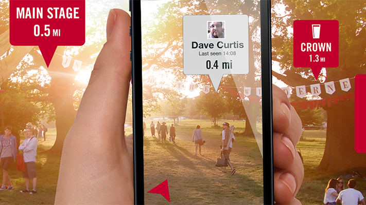
- Offline Each friend locations were updated in real time, and synchronised when mobile signal was available. Each friend could see the location and corresponding time stamp
- Torch When users devices had a flashlight, this was activated, and the screen darkened, so the user was not blinded by the device. When they didn’t, the screen went bright, so they could turn the phone around to see where they were going
- Markers Users could drop markers wherever they wanted, adding icons to ease re-discovery. These could be shared with friends, and reviewed. Users loved to use the AR mode, to see where they needed to walk.
Improvements included
- Weather The free service we used only provided daily weather forecast. Users would have preferred hourly. However, it feature proved that the weather was required, and that investment should be made to integrate a paid weather service.
- Tips Whilst these were liked overall, users did not like the advertisement of the Editions products, which came with a premium price. If suitable products were showcased, then this should have reflected the full inventory.
